
Fizzing up the soft drinks sector: 4 brands reinventing their look
The soft drinks sector is fizzing. Encompassing everything from well-loved soft drink staples to brand new flavours and the booming energy drink sector, the total UK soft drinks market was worth £16.7bn in 2021.
Currently one of the fastest-growing FMCG categories in the UK, its current success shows that consumers are willing to keep spending on small treats – although that doesn’t mean unhealthy: in 2021 low and no calorie soft drinks accounted for almost 70% of sales.
As the market becomes more saturated, it’s vital for brands to stand out on the supermarket shelf. In the past few weeks alone, some of the UK’s FMCG giants have completely re-vamped their product packaging, giving well-loved brands an extra pop.
Iconic soft drink Lilt has recently been re-launched into the Fanta family and 7UP has been given a fresh new look – School of Marketing CEO Ritchie Mehta says that these big-players in the industry are right to take their packaging seriously, “as it can make all the difference to their success.”
However, he adds that re-branding a product comes with “a healthy note of caution.”
“Fiddling with your existing brand assets has danger lurking in the wings. One only has to look at the disastrous re-design of Tropicana several years ago to see the adverse effects a poor re-design can impact on sales.”
He tells Grocery Gazette that its all about “striking the right balance” to know “what to keep and what to add” when it comes to branding and packaging.
“It is an art and science a marketer must grapple with.”
Grocery Gazette takes a closer look at why four major soft drink brands have taken on a whole new look.
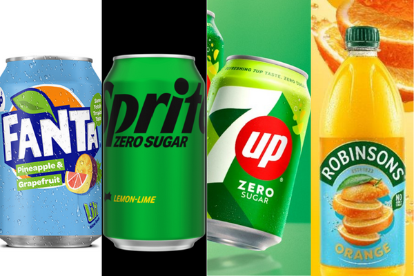
Lilt becomes Fanta Pineapple & Grapefruit
Iconic soft drinks brand Lilt was one of the first beverages to undergo a complete re-brand this year.
In February Coca-Cola revealed it would be axing the product and re-launching it under the Fanta brand.
While this may have come as a shock to die-hard fans of the 1970’s born drink, Coca-Cola said that it had been through a “gradual transition” to the Fanta brand over the past few months and still featured “a graphic nod to the totally tropical taste of the product’s roots”.
Fanta brand manager, Charlotte Walsham reassured Lilt lovers that the product retains “Lilt’s punchy taste profile and distinctive fruity flavour”, however has been re-branded as “it fits perfectly within the expanding Fanta family.”
“It’s just got itself a new name,” she adds.
Mehta says that the move came “in a bid to divest an underperforming brand whilst adding turbo fuel to a global one.”
“It’s a game of economies of scale and brand strength, so retiring a lacklustre local brand to enhance a global one, is a no-brainer.”
Sprite differentiates its Original and Zero Sugar offerings
Earlier this month, Coca-Cola also re-vamped lemon and lime-flavoured soft drink Sprite, giving it a new visual identity and an enhanced flavour.
The packaging, which is still easily identifiable by its bright green colour has been slightly altered, with Sprite’s Original version featuring white text and its Zero Sugar alternative repping black text.
The Zero Sugar offering will also now offer a lighter taste profile.
Coca-Cola Europacific Partners GB, vice president of commerical development, Martin Attock says the revamp gives a “clean and stylish edge to the classic Sprite look”, which also helps in “delivering impact on shelf.”
While many brands switch up their packaging designs to stand-out among competitiors, Mehta says this was “to create distance between their own products.”
7UP unveils a new brand identity
PepsiCo soft drink brand has created a new identity with a packaging refresh in its first major overhaul in over seven years.
Maintaining its iconic green colour and introduced with the expression ‘New Get Up, Same 7UP’, PepsiCo SVP and chief design officer, Mauro Porcini says the new visual identity was inspired “first and foremost by the brand’s creation of moments of UPliftment throughout its history.”
Looking to elevate the brand’s international positioning, he says that the “bright and confident” look aims to “echo across cultures, regions, and languages.”
7UP VP global brand marketing, Eric Melis adds that the ‘UPliftement’ concept “feels like a natural fit for the beverage brand “to drive this narrative forward.”
Robinsons modernises its brand
Long-standing squash brand, Robinsons has undergone a rebrand across its core range, including its Fruit & Barley, Benefits and Minis.
The new look aims to modernise the brand, with a simplified design which features bold colours and images of real fruit to re-enforce the flavour of the drinks.
Robinsons said that the investment in the brand is to create standout and help to drive relevance with modern families.