
Amstel unveils refreshed visual identity
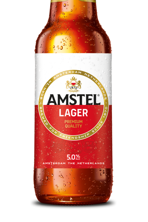
Amstel has launched a refreshed visual identity that aims to showcase the brand as a premium option within the beer category.
The new visual identity features a redesigned logo and packaging that aims to highlight the brand’s long-standing history in the alcohol market.
As part of the redesign, Amstel’s golden circle was given greater distinction, and the crest was modernised to reference the brand’s heritage.
There is a new typeface on the wordmark which was inspired by signage that had previously marked Amsterdam’s bridges.
Another change to the bottle’s design includes a horizontal split on the logo and wave pattern on the packaging, which showcases Amstel river’s water surface and flow.
The core packaging is set to roll out across both bottles and cans and will remain consistent across markets with certain visual elements altered for local needs.
The brand’s new designs have now launched across 11 markets in the Americas, Africa and Europe with a full transition planned by the end of 2027.
Subscribe to Grocery Gazette for free
Sign up here to get the latest grocery and food news each morning
Lizzy Wakkie van de Venn, global marketing manager at Amstel, said: “Our new visual identity celebrates Amstel’s unique Amsterdam heritage while bringing it into a contemporary context.
“Founded in 1870 by two friends who set out to brew a better beer that was worthy of their friendship, Amstel has always stood for quality, craftsmanship and connection.
“With this evolution, we’re staying true to what makes Amstel distinctive while ensuring it remains relevant and resonates with today’s consumers.”
Ximena O’Reilly, global director and head of design at The Heineken Company, added: “The changes to the typography, golden circle, crest and visual system are subtle but impactful. These design changes together magnify the ‘golden moments’ that mark our values of bonding, quality and care.”