
Aperol launches new bottle to ‘boost shelf visibility and highlight Italian roots’
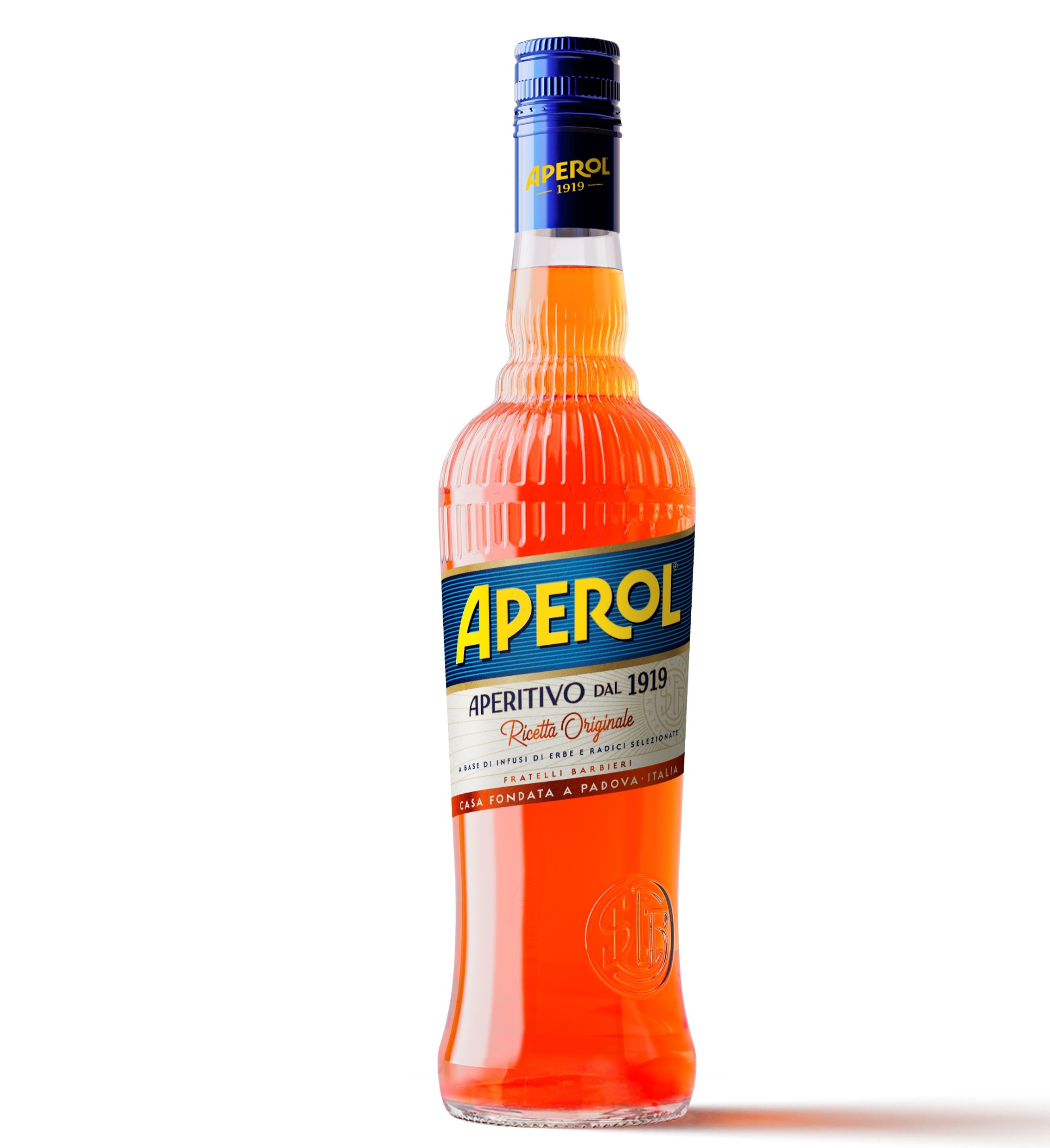
Campari Group has unveiled a refreshed bottle design for Aperol, which reinvents the classic look with brand new features.
This is part of a refresh for the popular brand, which aims to boost shelf visibility and highlight Aperol’s Italian roots.
The new bottle features a smaller font label and a monogram of the Barbieri brothers, who crafted Aperol in 1919, to highlight the brand’s heritage.
Additionally, there is rippled glass around the bottle’s shoulder and a refined silhouette which was inspired by Italian architecture.
Campari Group has continued to maintain the original recipe, which gained the brand global popularity across various markets.
Subscribe to Grocery Gazette for free
Sign up here to get the latest grocery and food news each morning
Andrea Neri, managing director at House of Aperitifs said: “This new bottle is a celebration of what has always defined Aperol.
“It reflects our Italian roots while bringing a more contemporary expression to an icon enjoyed around the world. Every detail has been carefully considered to enhance the Aperol experience and reaffirm the brand’s place at the heart of modern aperitivo culture.”
The new design is set to roll out across the company’s portfolio, including Campari, Courvoisier, Wild Turkey and Espolon at on-trade and off-trade retailers from March onwards.
This product refresh comes after the shares at Campari tumbled last year in December after Italian tax police confiscated €1.3 billion (£1.1 billion) worth of stock linked to the drinks maker’s parent company.