Dash dials up flavour cues in new product redesign amid retail push
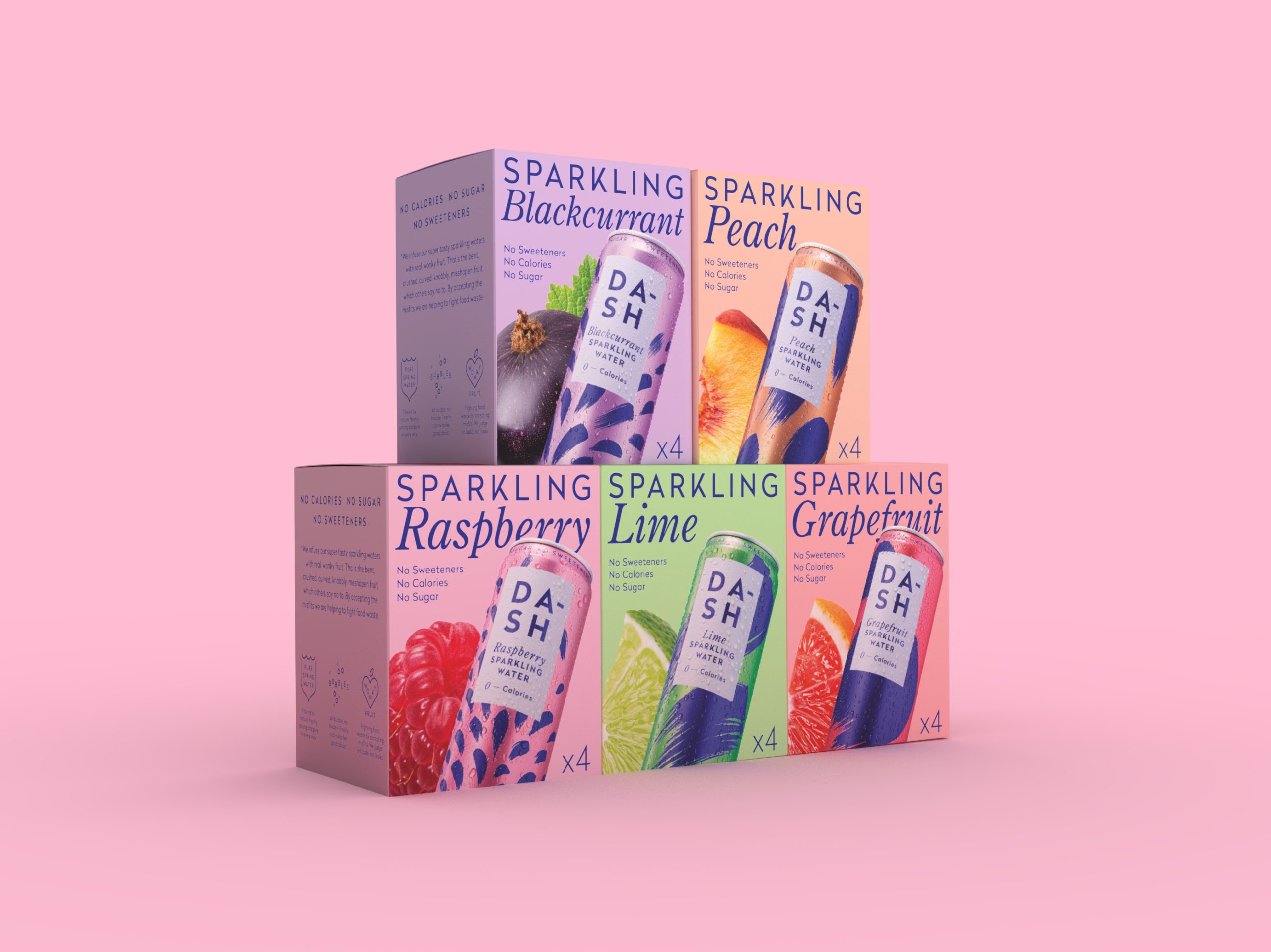
Dash Water has launched a fresh new packaging design to debut its new retail push, while showcasing both its full-flavour taste and health credentials and its mission to tackle food waste and promote sustainability.
The new look, created by Horse Studio, puts fruit front and centre with bold, colourful imagery designed, which the soft drink brand says is to reflect the drink’s refreshing, natural taste.
While the drink remains sugar-free, sweetener-free and calorie-free, Dash’s co-founder said the new branding dials up taste appeal and shelf standout.
“We’ve always been known for our health credentials, no sweeteners, no sugar, no calories, but our customers consistently tell us they love Dash for the taste,” said Dash Water co-founder Jack Scott.
“This new packaging reflects exactly that: the bright, bold colours scream ‘refreshing’, while the fruit-forward design signals ‘natural’. By combining our two biggest strengths, taste and health, we’re creating a space in the market that’s completely our own.”

Subscribe to Grocery Gazette for free
Sign up here to get the latest grocery and food news each morning
Alongside the redesign, Dash is launching a 12-pack format in-store for the first time, bringing a bestselling online product to retail shelves. The move comes in response to rising demand for value, convenience and fridge-ready formats, particularly in warmer months.
“75% of Dash’s online sales come from 12-packs,” added Scott. “So bringing that format in-store was a no-brainer… We want to make it as easy as possible for people to make better choices this summer, without compromising on taste.”
The new cans continue to champion wonky fruit, using bent or misshapen produce that would otherwise go to waste, as the brand’s commitment to sustainability remains central, with all packs fully recyclable and ClimatePartner certified.
The brand also maintains its B Corp certification, supporting climate projects and reducing emissions through thoughtful sourcing and packaging.
With bolder fonts, cohesive visuals and a strong sustainability message, the business added that new packaging marks a new chapter for it as it seeks to stand out in the fast-growing functional and better-for-you drinks space.