In pictures: Tesco campaign reimagines logo with food products

Tesco is showcasing the quality of its products in a new campaign that redesigns its logo with everyday grocery items from customers' weekly shop.
MarketingNewsSupermarkets

Tesco is showcasing the quality of its products in a new campaign that redesigns its logo with everyday grocery items from customers’ weekly shopping.

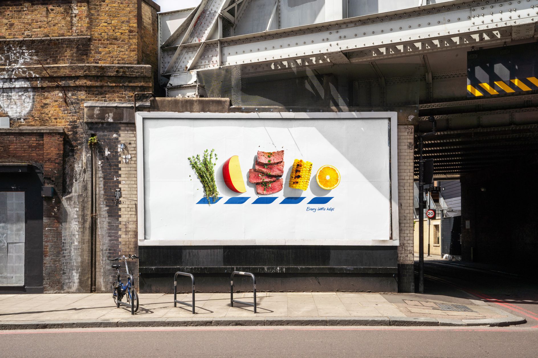
Named ‘Icons’, the out-of-home campaign depicts multiple billboards, each depicting five different items to represent the individual letters of the supermarket giant’s name.

One billboard shows the letters “T”, “E”, “S”, “C”, and “O” replaced with photos of a tomato, éclair, spring onions, coconut and oyster mushrooms, accompanied by the iconic blue dash chevrons and the tagline “Every little helps”.

Other posters feature produce such as a tangerine segment, edam cheese, strawberries, chilli and okra.

Photo: Tesco’s advert features a new grocery product for each letter of its name.


Subscribe to Grocery Gazette for free

Sign up here to get the latest grocery and food news each morning


Showcased in areas with high footfall such as London train stations, Tesco said the campaign aims to remind shoppers that the grocer is a reliable source of quality food.

Tesco UK marketing director Murray Bisschop said: “We know quality is so important to our customers, regardless of whether they are treating themselves to a Finest steak or preparing a quick and economical stir fry.”

“We wanted a campaign that heroes the quality of our products in a clever and beautiful way and we love how the campaign has turned out. I hope people will have fun guessing the letters and might even find some inspiration for their next meal too!”

The marketing push comes as Tesco achieved its largest supermarket market share since 2017 earlier this month, as its share hit 28%, up from 27.4% last year, according to new data from Kantar.

The figures follow Tesco raising its profit expectations at the start of October as half-year profits soared 10% and sales jumped 4%.

MarketingNewsSupermarkets

2 Comments. Leave new

  • Brian Wilson 2 years ago

    Oh dear.

    Reply
  • Neil 2 years ago

    Whoever approved this needs a reality check.

    It’s too much hard work to bother, so in effect some random food pictures over the 5 blue parallelograms normally under T E S C O letters.

    There is barely even any brand identity or association to Tesco.

    Fail.Waste of money.

    Reply

Leave a Reply

Your email address will not be published. Required fields are marked *

Fill out this field
Fill out this field
Please enter a valid email address.

In pictures: Tesco campaign reimagines logo with food products

Tesco is showcasing the quality of its products in a new campaign that redesigns its logo with everyday grocery items from customers' weekly shop.

Tesco is showcasing the quality of its products in a new campaign that redesigns its logo with everyday grocery items from customers’ weekly shopping.

Named ‘Icons’, the out-of-home campaign depicts multiple billboards, each depicting five different items to represent the individual letters of the supermarket giant’s name.

One billboard shows the letters “T”, “E”, “S”, “C”, and “O” replaced with photos of a tomato, éclair, spring onions, coconut and oyster mushrooms, accompanied by the iconic blue dash chevrons and the tagline “Every little helps”.

Other posters feature produce such as a tangerine segment, edam cheese, strawberries, chilli and okra.

Photo: Tesco’s advert features a new grocery product for each letter of its name.


Subscribe to Grocery Gazette for free

Sign up here to get the latest grocery and food news each morning


Showcased in areas with high footfall such as London train stations, Tesco said the campaign aims to remind shoppers that the grocer is a reliable source of quality food.

Tesco UK marketing director Murray Bisschop said: “We know quality is so important to our customers, regardless of whether they are treating themselves to a Finest steak or preparing a quick and economical stir fry.”
“We wanted a campaign that heroes the quality of our products in a clever and beautiful way and we love how the campaign has turned out. I hope people will have fun guessing the letters and might even find some inspiration for their next meal too!”

The marketing push comes as Tesco achieved its largest supermarket market share since 2017 earlier this month, as its share hit 28%, up from 27.4% last year, according to new data from Kantar.

The figures follow Tesco raising its profit expectations at the start of October as half-year profits soared 10% and sales jumped 4%.

MarketingNewsSupermarkets

Social

SUBSCRIBE TO OUR DAILY NEWSLETTER

  • This field is for validation purposes and should be left unchanged.

Most Read

Most Read

MarketingNewsSupermarkets

2 Comments. Leave new

  • Brian Wilson 2 years ago

    Oh dear.

    Reply
  • Neil 2 years ago

    Whoever approved this needs a reality check.

    It’s too much hard work to bother, so in effect some random food pictures over the 5 blue parallelograms normally under T E S C O letters.

    There is barely even any brand identity or association to Tesco.

    Fail.Waste of money.

    Reply

Leave a Reply

Your email address will not be published. Required fields are marked *

Fill out this field
Fill out this field
Please enter a valid email address.

RELATED STORIES

Latest Feature

Menu

Please enter the verification code sent to your email: